Case Study: Redesigning Whiplano for Creators and Supporters
Introduction: A Platform with Promise
Below is a brief recap of the project with visuals. A more comprehensive case study is available on my blog.
When I first explored Whiplano, I could tell it was an exciting idea: giving creators and supporters a way to collaborate and share ownership in creative projects. Originally, the initial focus would be on books or games. However, the existing site felt like it was speaking more to investors than the community or creative. I knew what I needed to help the team with—making Whiplano a welcoming, intuitive space for creators and supporters, with a user experience (UX) that turned complexity into simplicity.
A large immediate challenge was the customer facing tech stack: WordPress and Divi (no-code). While I am familiar with both of these, a flat hierarchy website for an interactive Web3 product might not provide the strongest results, but, we could definitely create a more attractive site that spoke to the right audience.
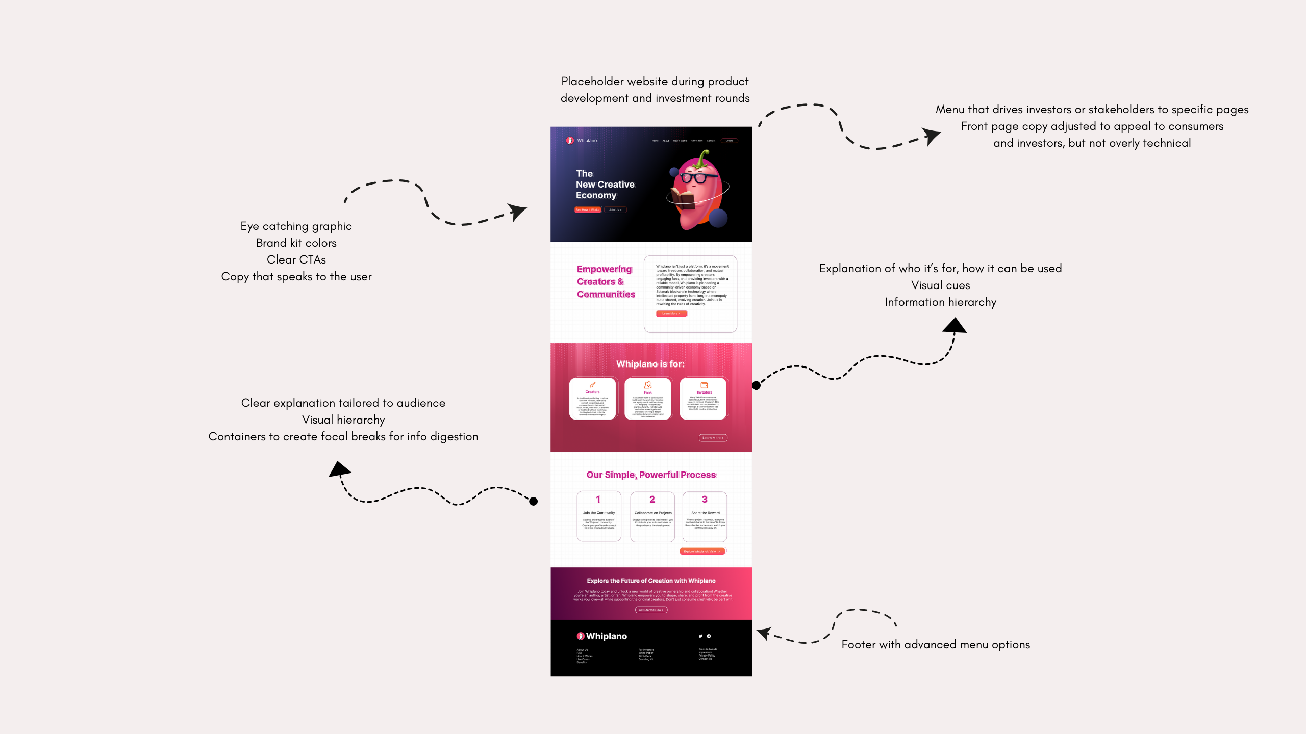
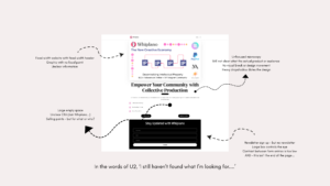
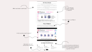
Here is the original site:
Starting with Research: What Creators and Supporters Need
To redesign the platform, I began my research into two key areas: industry trends and user pain points.
- Challenges in Publishing: I know first hand that creators often struggle with visibility, audience engagement, and fair revenue sharing. On the other side, supporters want meaningful ways to connect with projects they care about. The first step was to dive deep into online forums, discussion groups, and complaint or review boards for publishers to see what current creatives were saying.
- User Feedback: Surveys revealed that Whiplano’s in-house terminology (like “Tradable Rights Seeds”) and minimal onboarding were confusing and/or intimidating for new users that were not crypto native. Much as I suspected, users weren’t willing to explore the possibilities Whiplano could help with due to the haphazard structure of the site and the visible appeals for investor funding.
I also noticed a broader trend—non crypto natives are starting to be more open to exploring blockchain, but they need help understanding how it all works.
This is where Whiplano could shine.
Challenges:
- Unclear CTAs: The purpose wasn’t obvious.
- Repetitive visuals: Graphics lacked focus and were overused.
- Poor hierarchy: Visual breaks were missing, and design elements felt outdated.
- Low engagement: The audience struggled to connect with the platform’s purpose.
Research Steps:
- Interviewed 30 writers about publishing challenges, disruption fears, and opportunities.
- Affinity mapping
- Customer journey
- Bias mapping
- Card sorting
- Usability map
Key Changes:
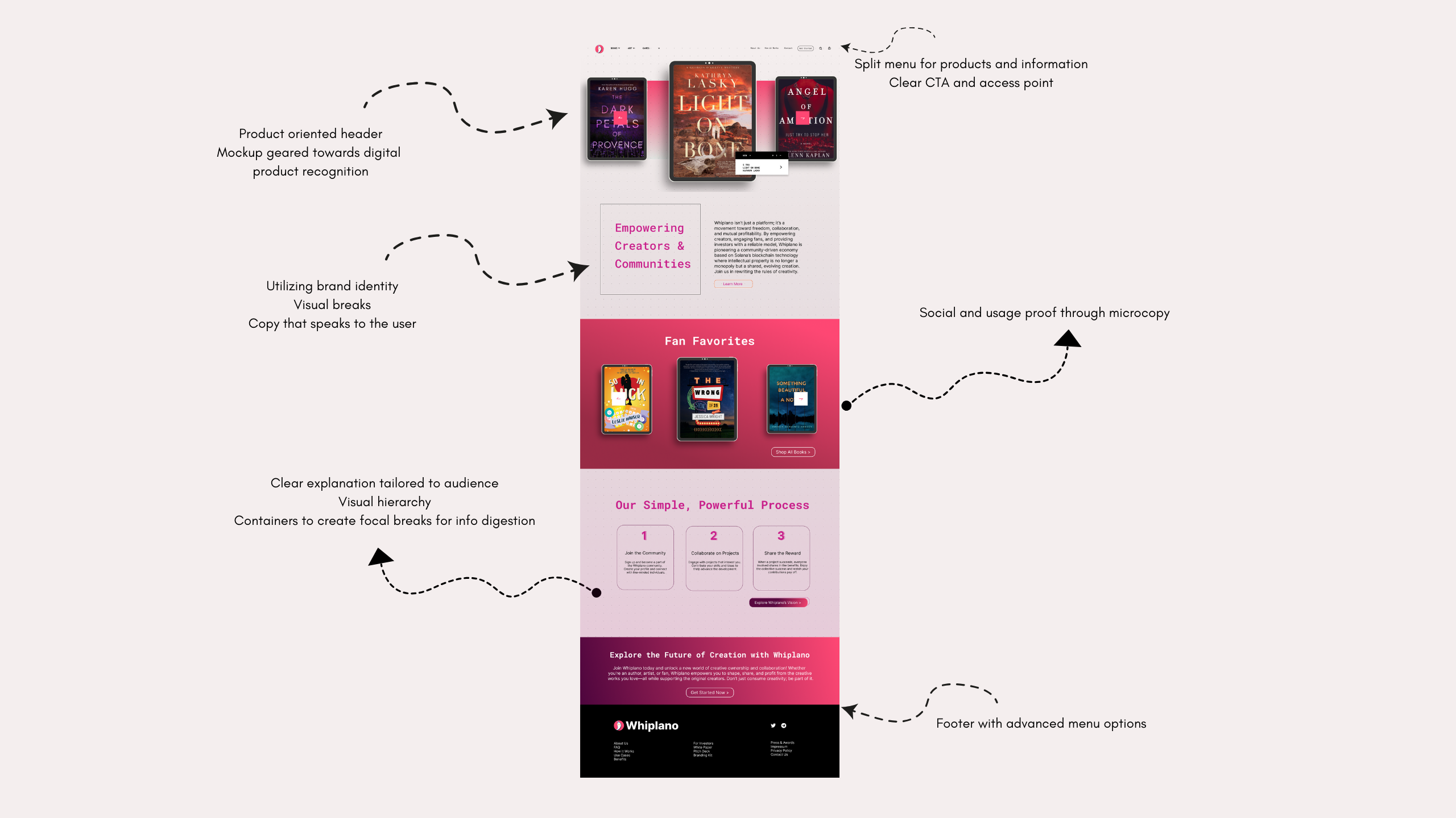
- Reorganized the layout for better readability and flow
- Simplified visuals and improved typography for a cleaner look
- Utilized colorful and playful brand identity
- Strengthened Navigation
- Utilized visual hierarchy
- Tailored content to end user over investor
- Added clear CTAs and micro cues for movement
- Removed repetitive phrasing and images
With my designs I addressed the following:
- For Writers: A clear, empowering pathway to publish on their terms.
- For Supporters: A rewarding way to invest in creativity and be part of the story.
- For Everyone: A platform that brings people together through intuitive design, clear calls to action, and shared goals.
The full case study and examination of the research in detail is available on my blog if you’d like to dig deeper into the process.
Category:
Date:
11/12/2024


