
Quick Fix: Centrifuge
Bridging RWAs and DeFi: Exploring a Centrifuge Dashboard Redesign
Introduction
This case study explores a redesign concept I created for the Centrifuge app, but it’s important to note that this work wasn’t done for Centrifuge. Instead, it was an exercise in exploring their platform when I was evaluating a potential job opportunity. I like to dive into the product, experiment with its current features, and assess whether it’s something I’d genuinely enjoy working on. Centrifuge caught my attention for its mission to bridge real-world assets (RWAs) with the decentralized finance (DeFi) ecosystem—a space I believe will push continued adoption of on-chain potential to a wider audience.
About Centrifuge and RWAs
RWAs represent a rapidly growing sector within web3, as they unlock tangible, income-generating assets like real estate, treasury bills, and credit for blockchain-based investment. By tokenizing these assets, Centrifuge enables access to traditionally illiquid markets while increasing transparency and reducing inefficiencies. This innovation is a game-changer for the web3 ecosystem, as it fosters trust, drives adoption, and diversifies use cases for decentralized finance.
Centrifuge’s impact is significant—it’s one of the leading platforms bringing real-world value into the DeFi space, offering a practical and scalable solution for institutional and individual investors alike. With this context in mind, I decided to explore their dashboard design, assessing how it communicates this groundbreaking mission to users and how it might be enhanced to provide a seamless, intuitive user experience.
Pinpointing the Pain Points
Through my analysis, I grouped the primary issues into three categories to clarify what needed to be readjusted for ease of use following basic design heuristics:
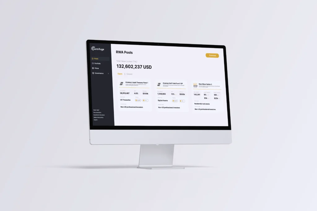
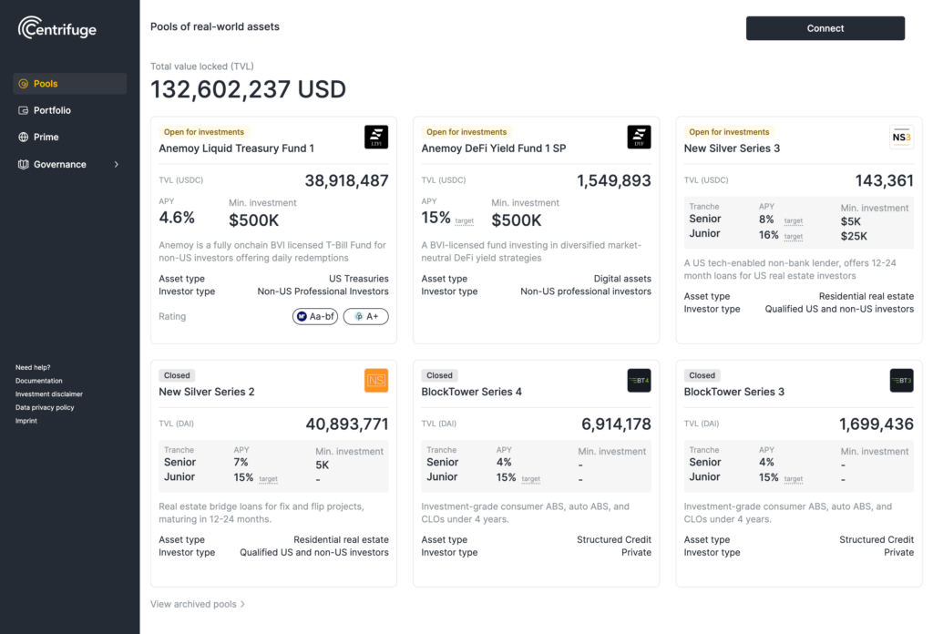
- Information Overload: All investment pools were grouped together, making it hard to distinguish between “Open for Investment” and “Closed” pools.
- Visual Hierarchy Issues: Important data, such as asset descriptions and pool metrics, competed for attention instead of guiding users naturally.
- Engagement Gaps: While the bright yellow “Connect Wallet” button adhered to Centrifuge’s branding, the overall lack of separation between elements made the layout feel cluttered and overwhelming.
Finding Solutions: Ideation and Redesign
This is where the fun begins! I explored practical solutions to improve both usability and aesthetics, ensuring the dashboard would meet user needs while aligning with Centrifuge’s branding and mission. Because this was more of a personal exploration, and without knowing what problems the team wanted solved or end KPIs to focus on, I skipped a few steps in the problem solving and went straight to design. I started with the cards, as that was the most obvious visual highlight.
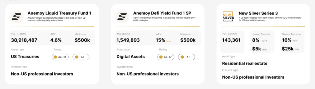
The original dashboard presented a range of investment pools for users, each with relevant financial data, including Total Value Locked (TVL), Annual Percentage Yield (APY), and minimum investment requirements. However, the design was dense and lacked a strong visual hierarchy, which could potentially overwhelm users and make it difficult to differentiate between open and closed investment opportunities. Additionally, while functional, the “Connect Wallet” button lacked emphasis and could have had a stronger call to action.
Clearer Visual Hierarchy
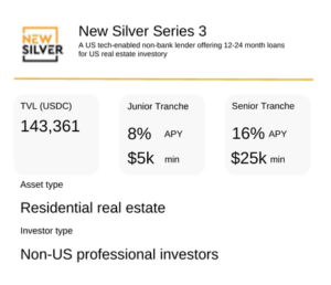
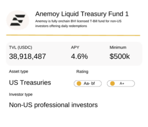
A stronger visual hierarchy was essential for guiding users through the interface and highlighting the most critical details of each pool. I restructured each pool card to improve readability and scannability by:
- Combining the pool title and description at the top: This ensures users can understand the purpose of the investment at a glance, without being distracted by numbers.
- Grouping key metrics (e.g., APY, minimum investment, and asset type) into segmented containers with larger fonts and consistent alignment.
- Subduing secondary information: Elements like investor type and asset ratings were displayed in a smaller font size to differentiate them from primary data.
This restructuring made it easier for users to prioritize important details, enabling quicker and more confident investment decisions.
Stronger Division Between Elements
One of the biggest pain points in the original design was the lack of separation between content blocks, which led to a “wall of information” effect. To address this, I:
- Added a soft grey background behind individual pool cards: This created visual boundaries and allowed each section to stand out, making the layout more digestible.
- Incorporated strategic whitespace: By increasing padding around content areas, I gave each pool the breathing room it needed, further reducing clutter.
These subtle adjustments significantly improved the flow and focus of the interface, helping users navigate the dashboard more intuitively.
Tab-Based Menu for Pool Status:
- To improve navigation, a tab-based menu was introduced to separate “Open for Investment” and “Closed for Investment” RWA pools. This allows users to filter pools based on availability, streamlining their experience and helping them quickly find actionable investment opportunities.
- This design choice reduces cognitive load by limiting the amount of information displayed at one time and provides a cleaner, more focused interface.
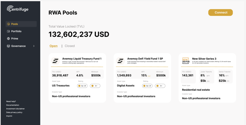
Emphasized “Connect Wallet” Button:
- To encourage interactions, the “Connect Wallet” button was redesigned to use Centrifuge’s branding colors, particularly a bold yellow, making it a prominent call-to-action element.
- Placing this button at the top and maintaining its distinct color ensures users are constantly reminded of the option to connect, simplifying the path to engagement and fostering a stronger connection between users and the platform.
The Results
From:
To:
The new design prioritizes usability, focusing on enhancing user engagement through intuitive navigation, clearer structure, and effective calls to action. By reorganizing the information flow, adding a tab-based menu, and strengthening the visual hierarchy, the dashboard has become more user-friendly, aligning with the goal of providing a seamless investment experience.
Expected Benefits:
- Increased User Engagement: The improved call-to-action and streamlined navigation make it easier for users to interact with the platform, potentially leading to higher wallet connections and more investments.
- Enhanced User Satisfaction: With information now segmented in a logical flow, users are less likely to feel overwhelmed, contributing to a more satisfying experience.
- Improved Decision-Making: The redesigned dashboard provides users with a better understanding of each investment pool, enabling them to make quicker, more informed decisions.
Conclusion
The Centrifuge app dashboard redesign focused on creating a more intuitive, visually appealing, and user-centric experience. By addressing the original pain points and implementing design improvements—such as tab-based menus, clear visual hierarchy, and a stronger call to action—the new design provides a foundation for an engaging, efficient, and effective DeFi platform experience. This case study highlights the importance of user-focused design in enhancing digital interfaces and delivering value to users in the competitive DeFi market.